He mainly works creating products for companies, people, artists, and others, but some of his portfolio of work includes photography related aspects which can be easily linked back to the topic disguise.
Here's some of his work:


This photo is quite interesting because the words on the face have the ability to tell a story. It looks quite simple and I'd imagine it would be quite simple to recreate a similar effect. The photo itself is quite intense due to the angle of the face and because the camera was obviously held above the subject, the eyes appear to be boring into the camera itself. The completed piece is similar to the experiment we did with photos made of words in a different module but both techniques have the ability to produce very different outcomes suitable for different things.
Recreations of Stefan's work:
 It was really easy to recreate Stefan's work because all it really was was writing words using the paint tool onto a face (Although it took quite a while). Sagmeister's original piece was created as an album cover so there were lots of words they could write on the face, from song titles to the lyrics themselves. I decided to write poems about loneliness onto the subjects face in my recreation because personally I think that the use of the fish-eye lens creates a very lonely image, Like everything is swallowing up the person. I'm happy with how it turned out because you can clearly see that it is based on Stefan Sagmeister's work, which is what I was going for.
More:
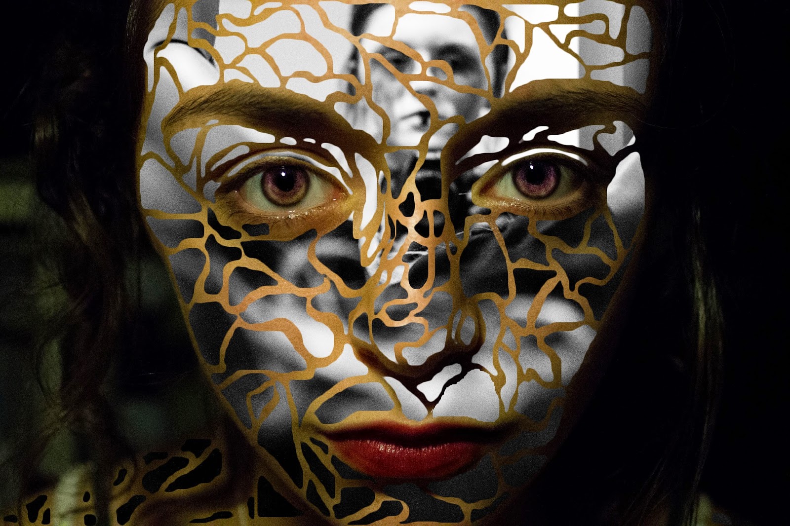
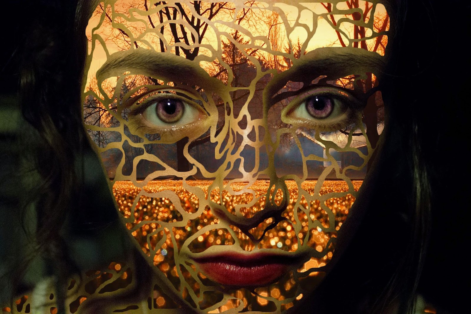
 To create these recreations, I took my photo into Photoshop and added a blank white layer underneath the photo itself. Then I used the lasso tool to select different shapes and delete the picture, revealing the white background. It took quite a long time to cut out all of the shapes as well as refining the edges of them as well but I'm pleased with the effect it produced and it looks like the work Stefan produced. After creating the plain, more-or less template, I went on to experiment a little bid with colours and patterns.
 It was actually really strange to see how the different colours and things effected the shape of the face. I experimented with flags, patterns, colours, and even underlayed photographs that I had taken and ones I'd gotten from the internet (the autumn and space photo's were sourced from the internet, the other photo is mine). My least favourite piece is the rainbow one because it doesn't look very defined and I don't like how the colours mix. I feel like the ones with the photographs underneath look the coolest but they could all serve different purposes.


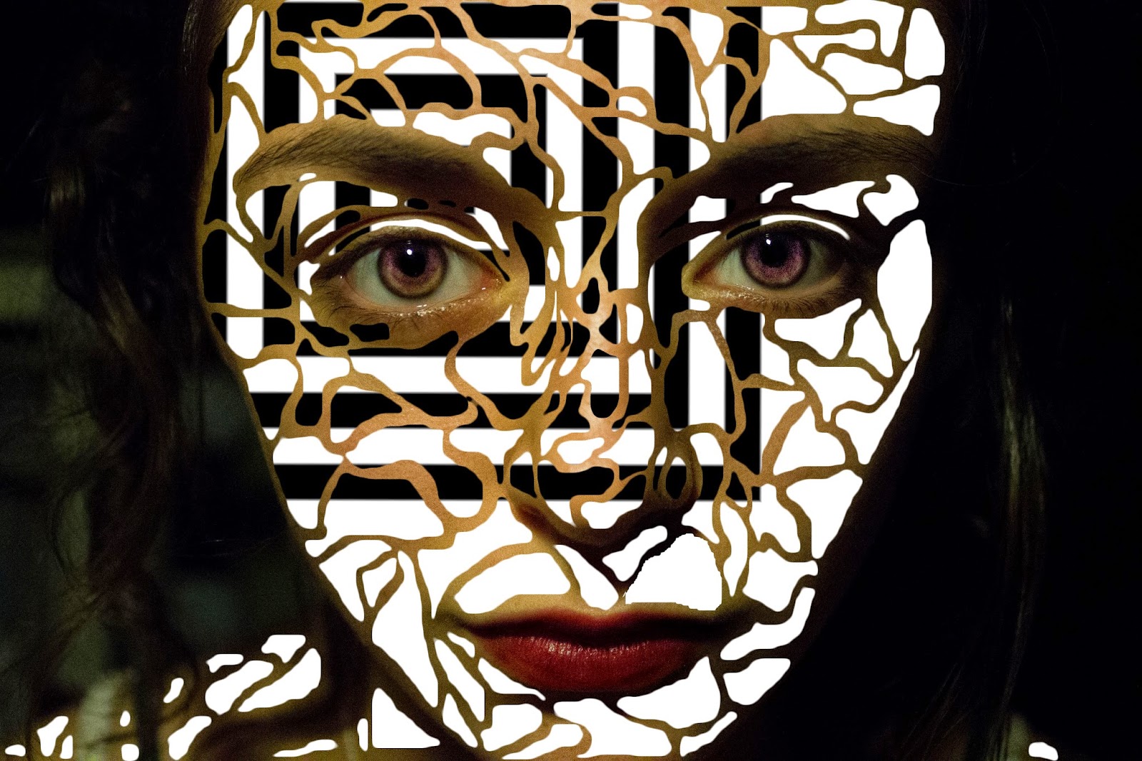

 The image on the right is, in my opinion, the least successful because there's no definition in the lines between the colour so it all looks quite faded and weak. IfI were to re do it I'd probably just burn the edges of each section.

Recreations of Stefan's work:
More:
No comments:
Post a Comment