Maurizio Anzeri is an Italian artist, born in 1969, Italy, and living in London.
Anzeri creates beautiful works of art by either taking photographs or using older, found ones and then embroiders onto them with thread in elaborate patterns.
I think the idea of embroidering straight onto the photographs is probably pretty difficult to do, especially if you have no sewing experience (a.k.a- me), but the colours and directions Anzeri uses in his work either compliment or contrast with each other so well. He almost always revolves the thread around one eye which keeps the focus point evident and intentional rather than the viewer not knowing where they're supposed to be looking on the photo, the one eye uncovered is almost like a grounding point, keeping people from getting lost.
Yellow and purple are complimentary colours on the colour wheel, these two colours embroidered in the way they have been really give an almost floral effect, It's no my favourite of Anzeri's work but it does look very interesting.
The image on the right is definitely my absolute favourite of Maurizio Anzeri's embroidery portfolio. I think it's incredible because the colour scheme consists of colours resembling the insides of a human which is really interesting. This idea is a nice contrast to the dull, faded colour in the portrait which has no human tones about it. The thread is almost mimicking the brain, spilling out of the subjects head in a beautifully abstract way.


.JPG&container=blogger&gadget=a&rewriteMime=image%2F*)
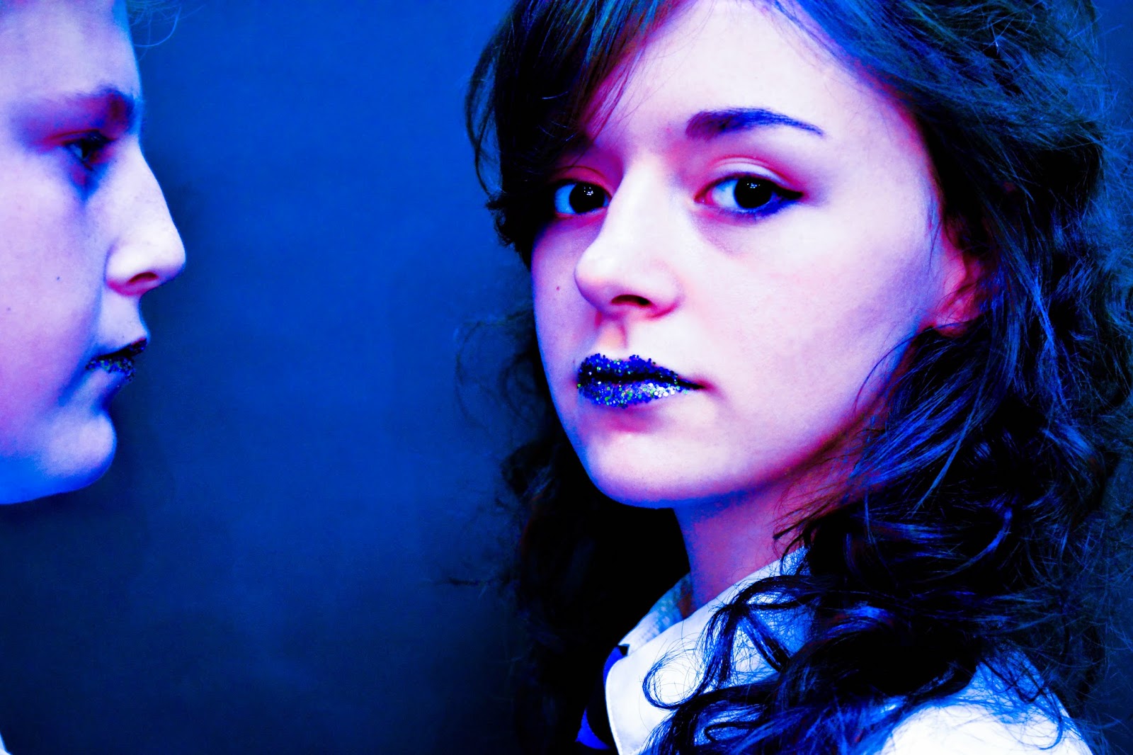


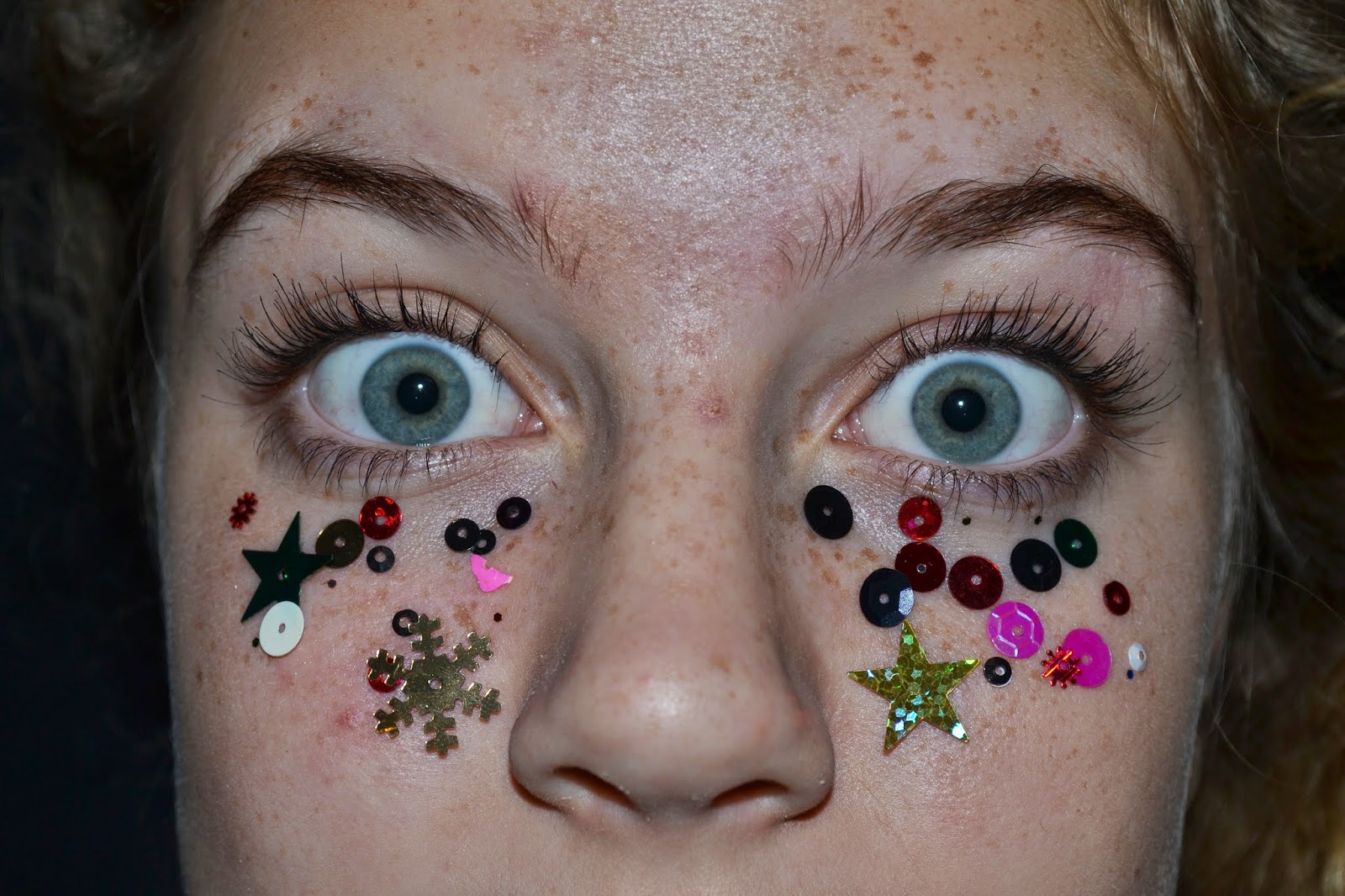
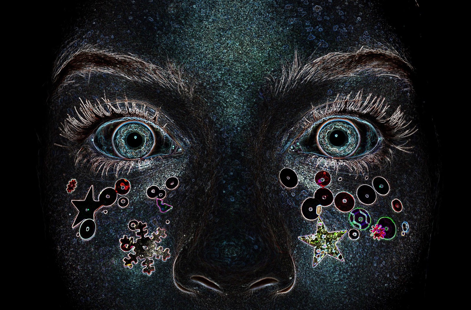


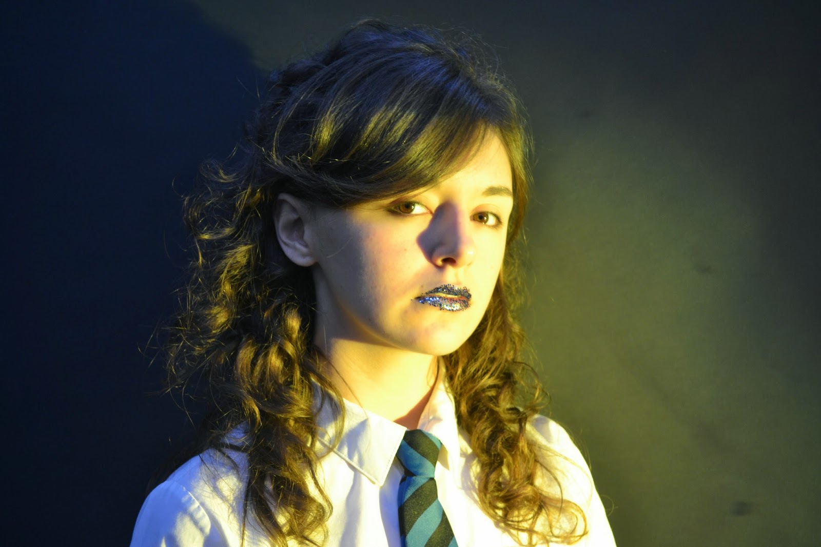
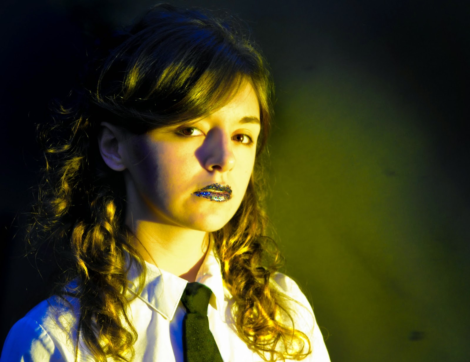
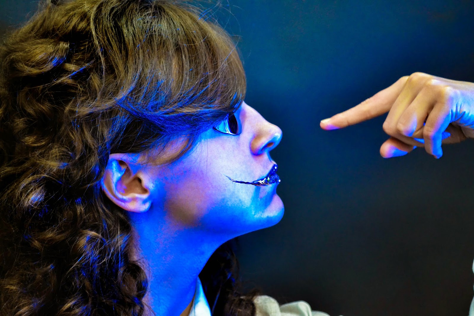
 I like this photo because it showed the glitter very clearly. The image itself is almost like a sinister Christmas type thing due to all of the glitter around the subject's mouth. I increased the clarity, contrast, shadows and then burnt areas including the background to give it a more spotlighted effect
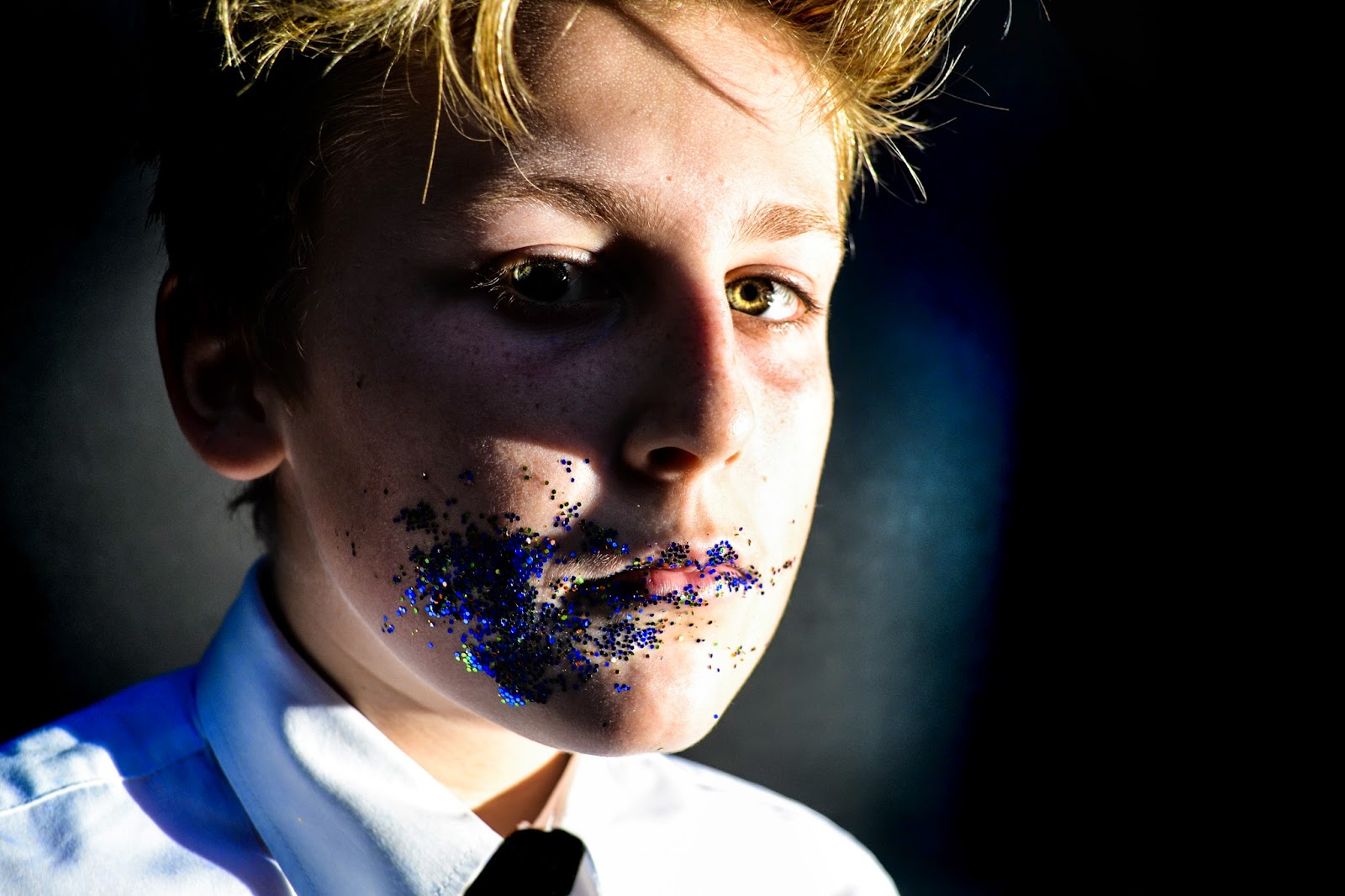
.JPG&container=blogger&gadget=a&rewriteMime=image%2F*)


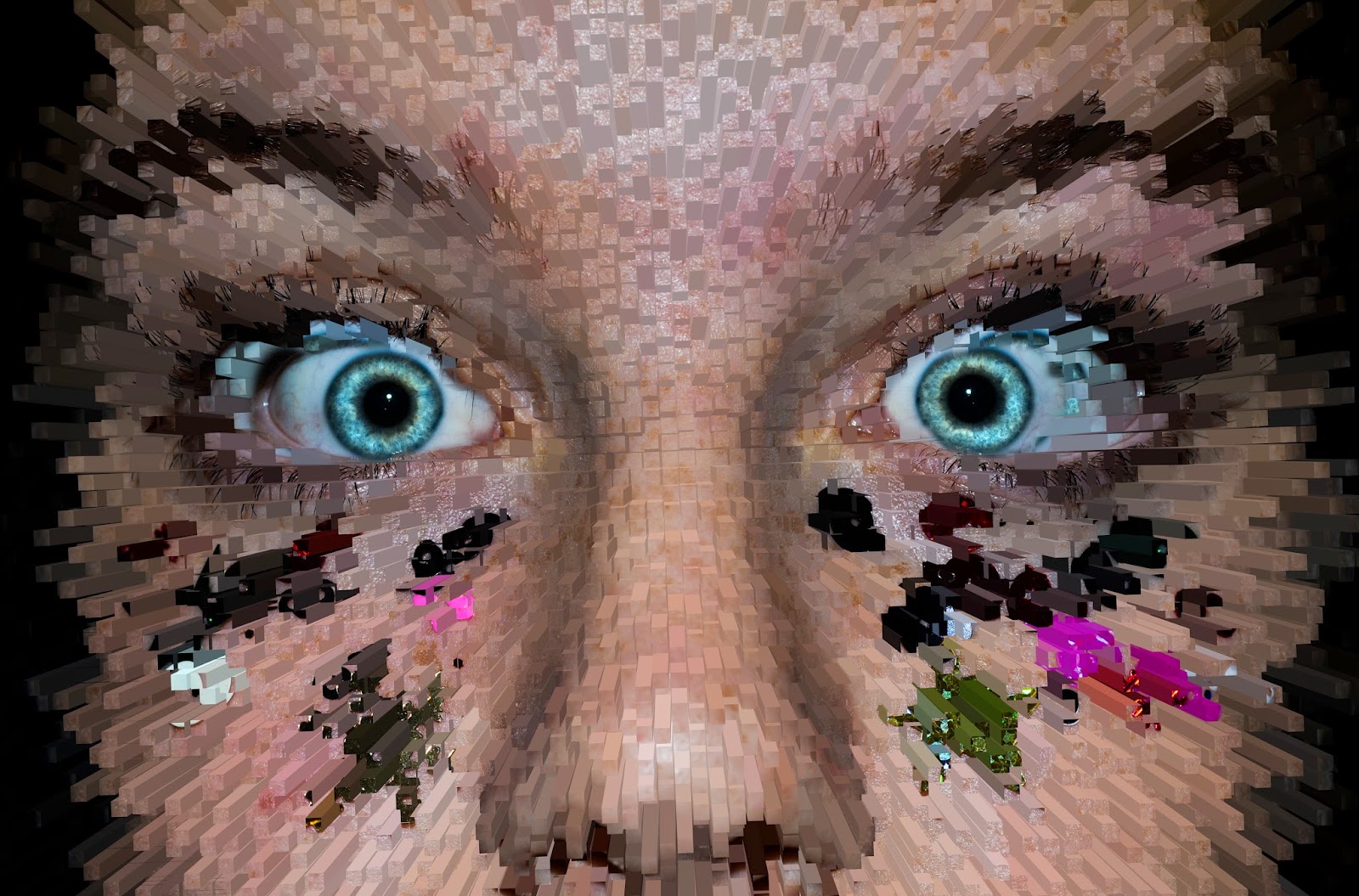
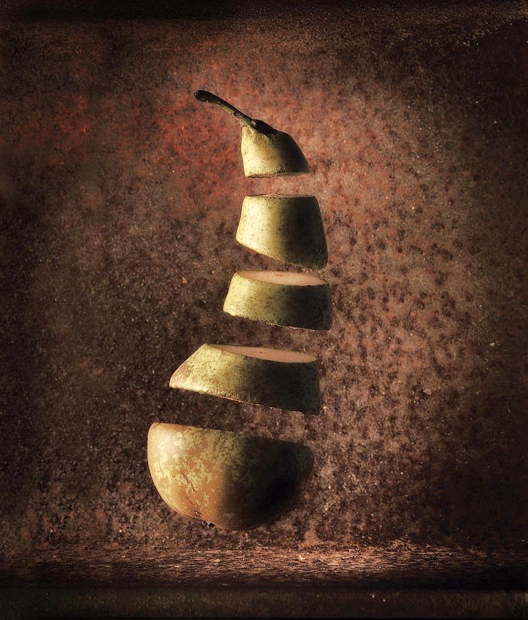 These are the two images I find most appeeling (pun intended). What he's produced is absolutely seamless, I would hazard a guess to say that he probably either used a wire to create these images or just used photoshop alone. When I create my final piece I'll be using a person and therefore be unable to cut them up and put a wire through them, so I'll focus on the Photoshop side of it. It's probable that he's taken photo's of each slice of fruit separately and then photoshopped them on the background. This sounds like it would be easy to do and is probably how I will do it in my final piece.


.JPG)