This photo is quite a juxtaposition of ideas and colours because the expressions and face paint in the photo has quite a dark feeling to it but I've edited it so that the colours are bright and quite like primary colours. The yellows, blues and pinky reds sort are almost exactly like cyan, magenta, and yellow and give the photo a whole other meaning. I'm quite pleased with how it turned out and that there are things like rule of thirds involved.
This photo is really weird in my opinion because the focus is actually on a couple of strands of hair and an arm. Despite this it sort of captures a level of creepiness that could't really be intentional. It's like people looking at themselves in the mirror, from this picture you can't really be sure what they're doing but you can assume it's making some sort of effort to disguise themselves. The focus point is really unusual but I think that's why it appeals to me because it's something you don't really see as often.

This picture became quite intense after editing, almost like the cover of a game or something. The colours are quite grainy due to the high clarity of the photo but that was the effect I was going for. The two subjects look very menacing and with the front subject more in focus than the back one, it makes it a little scarier that I've made her eyes red and makes her stand out despite the focus not being on her. I liked the shadows that were already in the photo so I enhanced it by altering the contrast and then using the burn tool to darken any other areas that I felt would make the photo more striking.

This photo is almost Joker-like in appearance. The make-up is quite sinister but again you can see a lot of use of the primary colours which I think makes the photo seem really raw. I like the angles of the face and hair which of course I have to thank the subject of the photo for providing me with the aesthetics but they provide a strong side profile which creates a stronger picture. It's a little underexposed so I might go back and tweak that in photoshop when I can.
I am really quite pleased with this photo which is surprising because I didn't think I would be. I really like the incorporation of textures and contrasting light and dark colours. The face itself has an almost lunar appearance which is interesting. I used the dodge and burn tool a lot in this one, using the dodge to brighten the glitter and the eyes to make them more piercing and using the dodge tool so there's a clear difference between the shadows and highlights.
I don't really like this photo but none the less it's an example of disguise and a good representation of the face painting we has done in the lesson.
This photo is very grainy and a lost looks posterized. Perhaps similar to a sort of Andy Warhol type of portrait. The graininess was intentional but I didn't expect it to come out like more of a painting than a photo, not that I'm disappointed with this effect. I'm not sure about the grey background though it does add to the dirty, grittiness of the image so I doubt I'll change it.
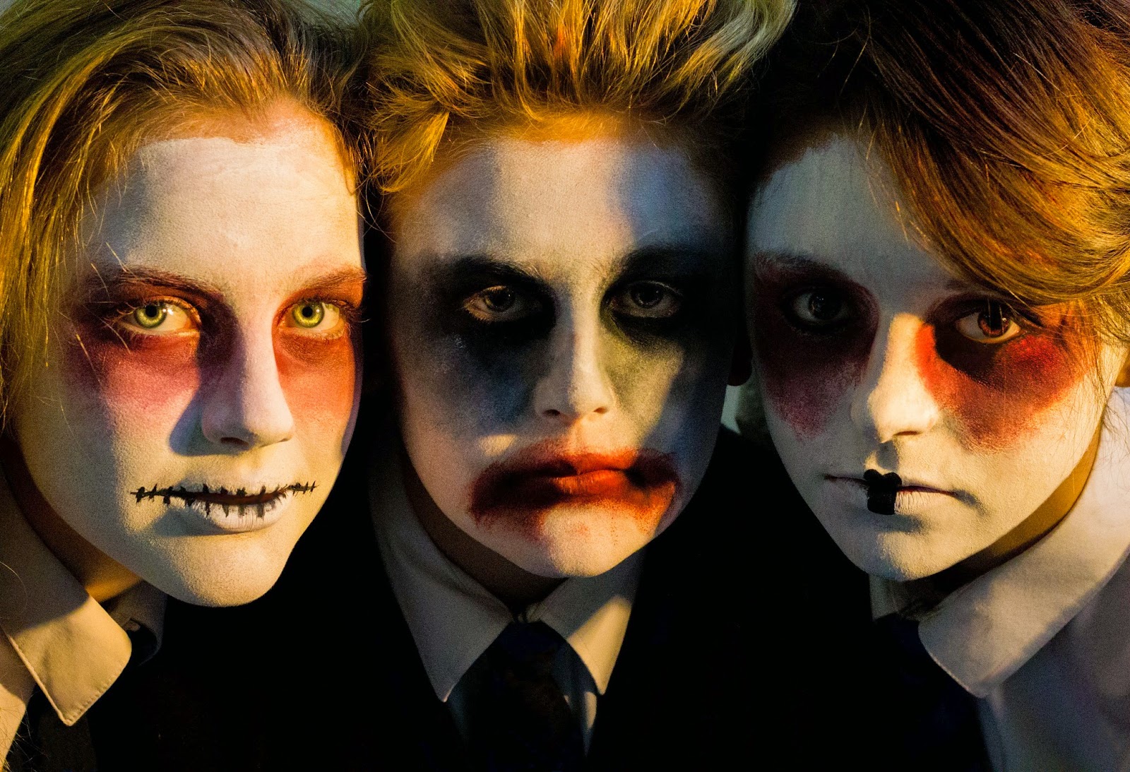
This photo is pretty cool because you can see all three faces with the complimenting face paints, it's good because they're all different yet share similar elements. I like the shadows and contrast of colours between the green eyes and red face paint on the left subject.


No comments:
Post a Comment