Saturday 25 October 2014

Amanda Clyne

Amanda Clyne is a Toronto based artist who's work aims to reify the fragile nature of looking and the  yearning to be seen. She first studied at the school of visual arts in NewYork before graduating with the prestigious drawing and painting medal from OCAD university in 2009.
Her work is really cool because from far away it looks like a regular photo but as you focus on the photo itself and the subjects in the photo you see fragments of faces disguised in one another. The effect is like a hideous beauty.
I love the colours Amanda uses in her paintings because she manages to give a feel to each one.  The right and middle paintings look very raw because of the pale blues and reds where as the left painting is quite fashionable looking, almost even mediterranean.


This is a digit recreation of Amanda's work that I created using photoshop. It creates a great effect despite how simple it is to produce. I just took two photos and then layered them on top of one another and then used the polygonal lasso tool to select rectangle sections on the top layer which I deleted to reveal the underneath layer. The angle makes the photo look very sinister because I took it as a selfie so the eyes are sort of looking up and staring into the camera.

Wednesday 22 October 2014

edited face paint pictures

This photo is quite a juxtaposition of ideas and colours because the expressions and face paint in the photo has quite a dark feeling to it but I've edited it so that the colours are bright and quite like primary colours. The yellows, blues and pinky reds sort are almost exactly like cyan, magenta, and yellow and give the photo a whole other meaning. I'm quite pleased with how it turned out and that there are things like rule of thirds involved.


This photo is really weird in my opinion because the focus is actually on a couple of strands of hair and an arm. Despite this it sort of captures a level of creepiness that could't really be intentional. It's like people looking at themselves in the mirror, from this picture you can't really be sure what they're doing but you can assume it's making some sort of effort to disguise themselves. The focus point is really unusual but I think that's why it appeals to me because it's something you don't really see as often.


This picture became quite intense after editing, almost like the cover of a game or something. The colours are quite grainy due to the high clarity of the photo but that was the effect I was going for. The two subjects look very menacing and with the front subject more in focus than the back one, it makes it a little scarier that I've made her eyes red and makes her stand out despite the focus not being on her. I liked the shadows that were already in the photo so I enhanced it by altering the contrast and then using the burn tool to darken any other areas that I felt would make the photo more striking.


This photo is almost Joker-like in appearance. The make-up is quite sinister but again you can see a lot of use of the primary colours which I think makes the photo seem really raw. I like the angles of the face and hair which of course I have to thank the subject of the photo for providing me with the aesthetics but they provide a strong side profile which creates a stronger picture. It's a little underexposed so I might go back and tweak that in photoshop when I can.

I am really quite pleased with this photo which is surprising because I didn't think I would be. I really like the incorporation of textures and contrasting light and dark colours. The face itself has an almost lunar appearance which is interesting. I used the dodge and burn tool a lot in this one, using the dodge to brighten the glitter and the eyes to make them more piercing and using the dodge tool so there's a clear difference between the shadows and highlights.
I don't really like this photo but none the less it's an example of disguise and a good representation of the face painting we has done in the lesson.

This photo is very grainy and a lost looks posterized. Perhaps similar to a sort of Andy Warhol type of portrait. The graininess was intentional but I didn't expect it to come out like more of a painting than a photo, not that I'm disappointed with this effect. I'm not sure about the grey background though it does add to the dirty, grittiness of the image so I doubt I'll change it.


This photo is pretty cool because you can see all three faces with the complimenting face paints, it's good because they're all different yet share similar elements. I like the shadows and contrast of colours between the green eyes and red face paint on the left subject.


Monday 6 October 2014

Ashkan Honarvar

ASHKAN HONARVAR

Ashkan's work in my opinion is really cool, the line work he uses adds a lot of texture, transforming it from a simple black and white photo to something with a little bit more meaning. I like the simplicity of his drawings, how he has just drawn eyes and branches and things, it makes it seem very close to nature, kind of grounded because it's been done as though all of the drawings are coming out of him. The scribble is like his head so it could represent how he is feeling.


I used the paintbrush tool to draw simple patterns over the face in the photographs to produce a similar effect to Ashkan's work.

John Rankin

RANKIN is a photographer who covers many different sections of the art. Celebrities, fashion and more. He also has a wide portfolio of beauty shots. This is not solely peoples faces alone but instead focusing on make-up as an art. the photo to the right is one of my favourite of his and of all beauty shots; it is very clean and sharp. There is a good contrast between the blacks and whites, the intense whiteness brings out the shadows making the photograph seem even more dramatic. The blue make-up to the sides affects the face in a way that accentuates the blue of the subjects eyes, creating an even more piercing look. I don't think there is supposed to be a strong, overpowering message in this picture- beauty shots don't usually have one, they're simply beauty shots- however if you were looking deeply enough to intentionally find one, it's as if the black around her eyes is coming from within and seeping out, like her darker side is coming out as it so rarely does but when it does: it's hard to miss. 

The photo itself is quite compelling in a way. I think that this feeling comes from not only the subject but also the composition and lighting. The subject has been positioned slap bang in the centre which in still life or landscape photography could be considered a flaw, but in portraiture like this it can really help make an impact. The image is very distinct, the stark white lighting makes every feature of the photo stand out making it even stronger.

~~~~~~~~~~~~~~~~~~~~~~~~~~~~~~~~~~~~~~~~~~~~~~~~~~~~~~~~~~~~~~~~~~~~~~~~

The black background in this photograph helps accentuate the dark eyes and create contrast with the surroundings. The make up has been done in an almost butterfly way. Butterflies are considered to be feminine and beautiful creatures, the droopy eyes and lazy tongue give an almost drowzy facial expression which sort of contrasts with the butterfly idea. I don't like this photo as much as the previous one. Despite the beautiful make up, I can't seem to come to terms with the facial expression. Despite my opinion, of course it has good qualities like every photo. The colours are bright and blend smoothly, not to mention the use of the black make-up which contrasts well with the white palour of the skin and other make-up. Rule of thirds have been used but not as they would be in landscaped and other denominations of photography. The subjects face is both oddly symmetrical but also not complimented by the lopsided shoulders and mouth.

~~~~~~~~~~~~~~~~~~~~~~~~~~~~~~~~~~~~~~~~~~~~~~~~~~~~~~~~~~~~~~~~~~~~~~~~


This photo is both bright and dark at the same time. The skin almost blends into the pure white background which illuminates the darkness of the eyes and the pink strands. This make-up creates a brilliant colour contrast as well as an interesting photograph. Not much of a story is visible here and as with all art everything can be interpreted in it's own way, differently. It's very abstract and almost like the pink strands are reaching out at you. I don't dislike this photo, it's very interesting to look at and stands out. 


~~~~~~~~~~~~~~~~~~~~~~~~~~~~~~~~~~~~~~~~~~~~~~~~~~~~~~~~~~~~~~~~~~~~~~~~

This photo is very beautiful in a strangely natural way. The way that the subjects face has been made-up with calming colours which almost appear to be airbrushed as they all blend together so well. The flower which runs from here eye down to her neck really ties in well with the wind effect which has blown her hair in such a way that appears that she is in touch with nature without it overpowering her. Rankin has done a great job on focusing on focusing the camera as the hair and face all appear in perfect focus despite the fact that each tendril is actually caught in motion. Rule of thirds has been used here both on the actual photo but also on the subjects face.This double use of R.O.T brings the viewers eye straight to that of the subject which is in perfect focus. The black background in the background really brings the subject out. A plain background seems to be a common occurrence in portraiture, probably because it doesn't distract from the subject.

~~~~~~~~~~~~~~~~~~~~~~~~~~~~~~~~~~~~~~~~~~~~~~~~~~~~~~~~~~~~~~~~~~~~~~~~


MORE OF RANKIN'S WORK


Sunday 5 October 2014

Giuseppe Mastromatteo

Giuseppe Mastromatteo has been working as an artist for more than a decade. After a period spent as a recordist assistant inside a record company, Mastromatteo graduated from Accademia di Comunicazione di Milano with a degree in art direction. He writes about art, teaches advertising at various significant academic institutes, and collaborates with the Triennale Museum of Milan in the role of art director. Since 2005, Mastromatteo’s works have been exhibited at the Fabbrica Eos Art Gallery Milan, Emmanuel Fremin Gallery in New York, Paris, Miami, Basel, Instanbul as well as national and international art fairs. He likes to develop his art projects in New York where he lived for three years. (Guiseppe's site!)
Guiseppe Mastromatteo does some really interesting work, focusing on people and portraiture. Personally, I love his work, it's so different from the norm and really makes you look twice. Even better, the way his finished pieces come out look really professional yet are probably not all too difficult to recreate on Photoshop, simple uses of the lasso tool plus some extras and it's probable we could produce a similar product but looking at his work you wouldn't be able to guess that.

A lot of his work fits into the 'disguise' spectrum, so here are a few of my favourite pieces of his work that I can't wait to adapt and recreate.

It seems as though Guiseppe has simply used the lasso tool to paste the eye and eyebrow onto the arm of the subject. This would be really easy to do but also looks wicked, it's almost a juxtaposition of ideas though because in a sense she's hiding behind her arm but at the same time her face is coming through where she's hiding.
The red lips pop in this photo preventing it from being too boring and neutral.
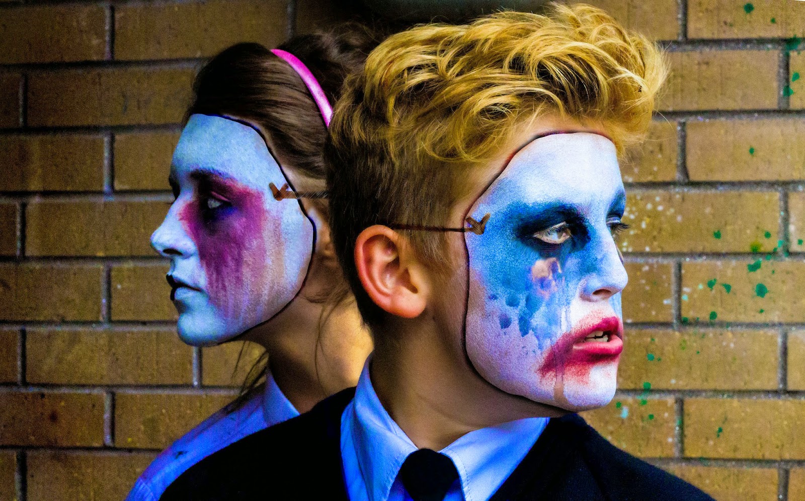
As with a lot of Guiseppe's photos he has used a model with skin somewhat resembling porcelain. This gives each picture a kind of surreal feeling because the subject always seems to have a doll-like appearance, I like this photo a lot because it seems like the man is wearing a mask of his face which could represent quite a lot. For example, he could be hiding behind a persona based off of who he is but not identically the same.
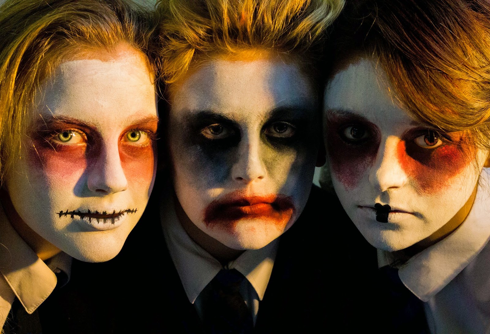
 These photos are all a part of his Indepensense series from 2009. I think they're all very original and the quality and colours are fantastic. I love the cleanliness and simplicity which is a complete juxtaposition to the content of the photos.
 <This photo is probably my favourite in this series because I love the colour contrast between the black of the hair and red of the lips.
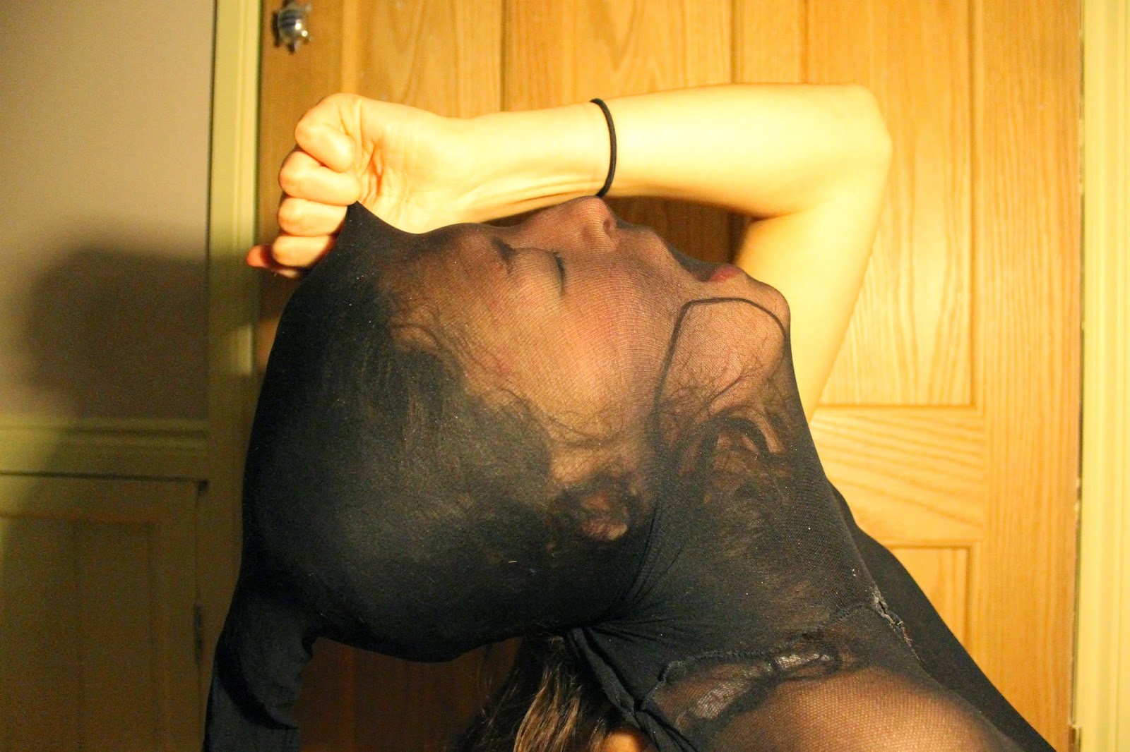
 The hair ones probably take the title 'disguise' most literally because the hair is used almost as a mask. When it comes down to it though I think I'd prefer something more discreet for my final piece.


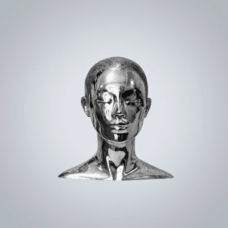
Here are some more of his photos from a different series:


I absolutely love the above picture but have no idea how it would be recreated, I'd like to have a go at experimenting but it just looks absolutely flawless, like a platinum silver bust or a trophy of sorts. 


MY RECREATION


To create this image I used the magic wand tool to select the basic shape of the face, inverse selection and then burnt around the outside to create the shadowed mad effect. To create the string tie I just used the paint brush tool and then burnt patterns into it before using various filters to get the desired effect. I'm quite pleased with how it turned out because you can clearly see my inspiration in the photo.


A Study in Stockings

For my first photo-shoot on the topic 'disguise', I decided to use stockings as the disguising implement. We were given a prompt to take photos through materials to create a distorted view and in a way a disguise. I decided to adapt this because I wasn't sure the images produced using this method would be all that interesting. The photos I did take turned out quite interestingly and also seem really quite creepy. I put tights on my head to disguise my face and then simply angled a light and put the camera on a timer to make the photos look quite home-made and natural.
Here are all of the images taken from the photo-shoot, they vary in quality because of the inability to focus on a certain area of the face when the camera is on timer.

 In my humble opinion, I look rather similar to an octopus in this, or Davy Jones from The Pirates of The Caribbean.


As you can probably see, a lot of these photos are rather absurd and the facial expressions may even cause you to laugh a little bit, but I thought to myself while taking these, I want these photos to look extreme, not like I'm just taking some rather precarious selfies with a pair of tights on my head.
It's also quite clear that some of them are quite unusable due to the fact that the focus is on the door and not the subject, despite this I managed to find a couple that I saw some potential in and edited them to make them a little more odd and/or striking.